
Of all the groups I have worked with, those in the philanthropic sector have some of the biggest opportunities to tell compelling stories with data. Yet the strategic advantage that can be gained through this is often missed: in some cases, no data are used when they could be incorporated to help make a stronger case, while in others the data that are included confuse more than they inform. And as data about foundations and their activities inevitably make their way into the public sphere, these communication challenges are heightened.
Bradford Smith, president of the Foundation Center, tells a story that illustrates what is at stake.
‘Years ago, I was in a foundation meeting where an industrious staff member, who had analysed hundreds of active grants, shocked the room by announcing we were doing far less to help the poor than we believed. That was then, and there was little concern that such an insight might leave the building and go public. Today foundations find themselves in a world where, one way or another, the data they have designed for internal purposes will increasingly be consumed by others. And it may be used to tell stories that are different from the carefully crafted ones that foundations create about themselves. This is going to be tough. In general, philanthropy came late to communications and foundations have labored to get beyond speech writing to strategic communications. Now, just as the messages are getting more sophisticated and soaring through cyberspace on the wings of social media, foundations will have to make sure their data supports their messages and vice versa.’[1]
In other words, foundations will need to become data-literate. A quick real-world example, focusing on the challenges of using data effectively for internal decision-making (a good place for foundations to begin honing their data presentation skills), serves to illustrate the importance of choosing the right data presentation strategies to communicate about foundation work.
I recall working with a client who wanted to frame a discussion for their board about where to use unallocated funds for the upcoming year. They shared with me the following visual:
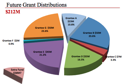
Let’s analyse this graphic from the standpoint of using data to tell a story. How would you score it with respect to each of the following principles of good practice?
1 Keep your audience top of mind.
Everything you’re doing is for your audience, so keep who they are and their needs in mind throughout the process: from figuring out what you want to communicate, to determining what data to show, to deciding how to show it, where to draw attention, and what story to form with it. Make it clear to your audience what you want them to know and why they should care: what’s in it for them and what you need them to do.
Does this graphic succeed in keeping its audience top of mind?
2 Choose a visual format that makes sense.
Line graphs are great for showing trends over time and bar charts are good for comparing categorical data. Pie charts (and area charts in general) are hard for people to read because our eyes don’t do a good job measuring angles and areas, so be cautious when using them. When choosing between a common chart type like a bar chart and something less common, my recommendation is generally for the common chart: it means less of a learning curve for your audience to face to get at the information you are providing.
Does this graphic employ a visual format that makes sense?
3 Resist the temptation to dress up your data.
3D, meaningless colour, background shading: these distract from your data by adding clutter without informing. When you’ve found the right angle – the right way to make your data compelling for your audience – there’s no need to dress it up, because the data itself becomes inherently interesting.
Does this graphic unnecessarily dress up the data?
4 Draw attention to the important parts of your visual.
Colour, size and position on the page are some of the easiest and most powerful ways to draw the audience’s attention to different parts of your visual. Don’t use colour to make things colourful, use it sparingly and strategically to draw your audience’s attention to where you want them to focus. If something is more important, make it big and place it in higher priority places on the page (since in Western cultures most people read left to right and top to bottom, the top left of the page is precious real estate: make it count!). Think of using colour and size to create a visual hierarchy on the page: this is a way to let your audience into your head via visual cues so they know what is most important and where to focus their attention first, what is next most important, and so on.
Does this graphic draw attention to the important parts of the visual?
5 Tell a story.
Stories have a way of focusing your audience’s attention and helping them understand why the data you are showing are relevant and important. I think of stories in terms of plot, twists and ending, where the plot is the context that is essential for your audience to know, the twists are the findings and what make your story compelling, and the ending is the call to action: what you need your audience to know and do. If you have a recommendation, state it clearly in words in your communication.
Does this graphic tell a story?
When used well, data can add credibility where we lack it, impart new knowledge, persuade people to support your vision, demonstrate impact, or help convince someone to take action. But it is not enough simply to show data; we want to tell a story with data.
Here’s what a remake of what the 3D pie chart could look like when we strive to tell a story with the data.
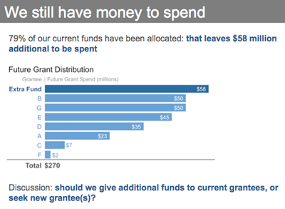
Whether your audience is prospective donors deciding whether to make a contribution to your cause or foundation leaders looking for direction as they steer the course of the organization, effectively incorporating data into your communication can enable faster, better decision-making. The key is keeping the goal of telling the story foremost in mind, even when data are the means through which it is conveyed.
1 http://pndblog.typepad.com/pndblog/2012/07/philanthropys-data-dilemma.html
Cole Nussbaumer specializes in the effective display of quantitative information; she writes the popular blog storytellingwithdata.com. Email cole.nussbaumer@gmail.com


Comments (0)